
Using Directed Acyclic Graphs in OLab
-an n-dimensional approach to assessment of decisions
Authors:
- David Topps
- Corey Wirun
- Doug Myhre
- Kent Hecker
- Rachel Ellaway
Directed Graphs
As a term, a ‘graph’ in mathematics is a shortening of ‘graphic formula’, essentially an image showing how a formula works visually rather than symbolically. The term ‘graphic’ comes from the Greek (via Latin ‘graphos’ meaning to write or draw). In English, words ending in -graphy reflect a sense of writing or otherwise representing something such that it involves representation for study. This is compared with -logy words which are to do with the study of something – biology is the study of life, biography is writing or representing one or more lives. Geology would be the study of rocks, geography is about representing or recording the earth. A graph then is a representation, an image, a recording, a visual abstraction.
Graph theory in mathematics is about representations of relationships. One graph may represent an algebraic construct (e.g. plotting y=x2-2) or another might represent a geometric construct such as a proof of Pythagoras’ first theorem. Both depend on a Cartesian coordinate model of two dimensions – x and y. While non-Euclidean geometry extends this to volumes by adding a third dimension of depth. These are not the graphs we are interested in. We are interested in graph theory related to representations of topologies:
“Although topology and geometry are often related and may even be applied to the same phenomena (albeit for different reasons), they afford very different perspectives on regularities. Geometry is about ‘local’ structures in terms of lengths, angles, arcs, areas, and volumes, while topology is concerned with ‘global’ structure in terms of connections, paths, deformations, and equivalences. The connection is that topology explores the properties of things that are deformed, twisted, and stretched but not torn, punctured, or joined” from RHE Pattern Epistemics. In development: p126
More specifically, we are interested in graphs that can represent ‘connections, paths, deformations, and equivalences’. The basic graph model for this is made up of nodes (also called vertices) and links (also called ‘edges’) such that nodes are where links meet and edges/links connect nodes. Consider these three graphs:
Figure 1: simple graphs with nodes and links
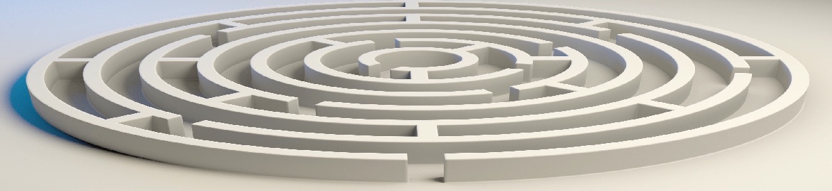
The left hand graph is one of the most basic graphs – two nodes (n1 and n2) connected with one link (v1). The middle graph is a little more complicated with three nodes and three links – to get from n1 to n3 we could either take v1 to n2 and then v2 to n3 or we could take v3 directly to n3. Anyone who has navigated on a car journey or booked an airline flight has had to think about such topologies. The classic map of the London Underground is such a topological map.
The right-hand graph adds the concept of directedness; a link has a direction so that you can only traverse a link in the direction indicated. A graph is cyclic if a path can circle or loop, it is acyclic if it cannot. This distinction matters in some mathematical analyses of directed graphs but in our decision-making concept maps, we are less concerned about cycles. In our example the right-hand graph is a ‘directed acyclic graph’ or DAG.
We have long been working with pathway-based virtual scenarios that are essentially DAGs. We developed OpenLabyrinth, now OLab, as a software platform to build DAG-based activities where a learner traverses a teacher-defined set of pathways making decisions on which specific paths they will follow. We call an OLab DAG a ‘map’ as there is an underlying topology.
For instance, the following two graphs in Figure 2 have the same topology but represent different things, the activity DAG on the left is about eating cake, the informational DAG on the right represents knowledge required to bake a cake:
Figure 2: two graphs representing different processes
DAGs are topological rather than cartesian – in a traditional cartesian map, placement of nodes on the map is important and has meaning; in a topological map, the positions of nodes are arbitrary, as are the size and shape of nodes, the length and direction of edges, and it is only the connections between the nodes (vertices) that matter. As an example, these two in Figure 3 share the same topology even though they are geometrically different (start and end nodes marked in white):
Figure 3: topologically equivalent graphs
Links can also be weighted or qualified thus:
Figure 4: weighted links or edges
This adds a semantic dimension: some links are stronger, of greater value, or otherwise qualified. Dimensions within a graph therefore include: what each node represents, what each link represents, what different sequences or pathways represent and so on. Weighted DAGs are essentially the path modelling aspect of structural equation modeling; qualitatively marked-up paths are essentially a kind of logic diagram, used for instance in representing program theories that might be found in realist inquiry.
In this context, we are working in at least three dimensions across graphs (in addition to the dimensions within graphs, each of which can be represented in one or more DAGs:
- Activity design – the predefined ways that someone is allowed to perform within an assessment event (bottom layer in Figure 5 )
- Performance report – the way a candidate does perform in an assessment event or the aggregate of multiple performances, either of the same candidate or of multiple candidates
- Construct emergence – the constructs (nodes) and relationships between them (edges) of what we are trying to assess in terms of tangible variables and latent constructs (SEMs)
Figure 5: three layers of DAGs
In this visual example in Figure 5, there are the three layers of DAGs (activity, performance, construct (A, P, C) – on left) that can be mapped to each other (on right). Note that in the construct emergence DAG, the white triangles are measurable variables and the black triangles are latent variables. There are therefore 6 DAGs here – the three basic DAGs: A, P, and C, plus the three DAGs that connect them AP, AC, PC.
This paper explores the ways in which we might portray and model these various in a Directed Acyclic Graph in OLab (or in other DAG-based tools). Another approach is to consider the use of heterogeneous graphs: in the above models, using homogeneous graphs, all the nodes represent objects of the same type. In a heterogeneous graph, nodes can represent different object types. See
DAGs and OLab
OLab uses Directed Acyclic Graphs (DAGs) in its core model. An OLab unit is called a Map. How a user navigates their way through a scenario or case (map) is determined by the Nodes, Links between the Nodes, the sequences these create, and any qualifiers attached to nodes or links in the Map (rules etc.). In the OLab Visual Editor that we use for constructing maps, it is easy to see how this works in Figure 6.
Figure 6: OLab3 map with nodes and links in a DAG
As we have noted, DAGs are also a common model for other forms of software (eg. Structural Equation Modeling (SEM) tools, qualitative analysis software (QAS – such as NVivo and Atlas.ti), and it has been helpful to find that there are a number of mathematical and conceptual models that can be employed to extract useful knowledge from DAGs. This includes constraint optimization, genetic algorithms and metaheuristics. (https://en.wikipedia.org/wiki/Metaheuristic)
Dimensions within OLab maps
Cyclical and acyclical – time as a dimension
Initially, we had some concerns about OLab because it is quite feasible to construct maps that have a cyclical component: we do have bidirectional Links and it is also easy to construct a pathway that loops back on itself. This could spoil the effectiveness of some of the analytic models which do depend on the graph being acyclic.
However, if we consider instead the performance map that is generated when the user plays a map, and how the temporal dimension is added by tracking sessions in OLab, we find that this removes the problem that some OLab maps are not acyclic. Although one could navigate a loop, or even go backwards and forwards along a Link, which would initially seem to be cyclical, if you consider the comments raised in the paper by , one does not travel in both directions along a Link or edge at the same time. Because you are only traveling one direction at a time, when you space out the pathways along the time dimension, they are no longer cyclical but spiral along the time axis.
[insert illustration of this – a 3D rotatable model would be nice but would be hard to do]
Semantic markup
It is also useful to consider the points made earlier, that the style of activity design in OLab’s Visual Editor provides only certain constraints on the graph. The pathway logic is only determined by the start node, end node and links. Nothing else in the Visual Editor canvas needs to represent a parameter e.g. the xy coordinates of the nodes can be easily modified without affecting the pathway logic. This then opens up the possibility of using some of these design attributes to represent other factors or dimensions e.g. thickness of a link, size of a node, color of a node. These might be single instance markup (following this link adds +2 to your score) or grouping instances (this is an indicator of decision making and is worth -1 point).
Cartesian markup
Furthermore, you can use the graph in activity design mode in the Visual Editor as an underlying abstraction to symbolize certain logic groups or patterns. You can also then use that same graph as a visualization when depicting how users navigated the map. We have described this previously as the Pathway Analysis function in Session Reports.[ref ).
A further simple expansion of that concept is illustrated in Figure 7: if you want to simply visualize whether a user chose the more, or less, preferred nodes in a dandelion, there is nothing in the Visual Editor layout that prevents the author from, say, placing the preferred nodes on the “good” side of the dandelion and undesirable nodes on the “bad” side of the dandelion. This would make it easier to see if they did “good”. Although topology is coordinate-free, a cartesian spatial model can be overlaid as an extra dimension to add richness to the information that a map, or its traversal, can generate.
Figure 7: OLab3 nodes grouped and colored
In , the map has been modified so that the “good” (blue) choices are placed on the right side of the map and the “bad” (red) choices are grouped on the left. We colored them for illustration. Neither the nodes’ color, nor their placement on the map canvas affects how the map is played or portrayed to the student.
Consider the factors or variables in SEM as being represented by dimensions. Because of the flexibility of the Visual Editor in OLab, where the node placement does not determine at all which decision paths are expected or permitted, this opens up the possibility of using that concept map to represent some of these factors or dimensions. For example, you could generally assume, as is commonly the case in manual map designs, that one is progressing through the map if one is moving downwards and rightwards. This is an arbitrary convention but serves our purposes well at this point.
4-dimensional volumetrics
On a basic 2-dimensional map, you can use the x and y coordinates to represent 2 factors, which is probably not enough to support our needs. But, as we noted above, you also have the time dimension: as you navigate the map, your progress is timestamped. So in displaying a Pathway Report, that provides a 3rd dimension of representation.
Although not possible at present, it would not be hard to introduce a , where the z-direction represents a 4th dimension. It might be useful to do some basic user interface acceptance to see if the directions of the xyz dimensions should be rightwards, downwards and distally. Nothing in the math places a particular constraint on these choices. It may be that having the 3D map as a rotatable object will help in some visualizations.
It should be noted in operationalizing these dimensional representations, the dimensions do not have to remain consistent across all nodes in the map. For example, you could (as we do with the OLab3 Visual Editor) break up the map into Sections. Within each Section, the relative xy positions of a node can assume a certain significance, for example, we use that pattern design utility to assign the order in which Nodes within a Section are displayed in the [[LINKS]] section for a Node.
Figure 8: OLab3 node placement can be used to affect Link order
In Figure 8, we have three sets of linked Nodes. On the left, all the pink nodes are placed on the same y-axis coordinate, to indicate that their order does not matter so Links to them can be randomized. In the middle orange set of Nodes, the curved placement allows the author to use either the x-axis or y-axis coordinates to indicate a preferred order in which the Links are presented to the student. In the green Nodes, they are placed so that the top three nodes have first priority on the y-axis, followed by the next two, followed by a single node. This means that there is some grouping or prioritization within the set but that Nodes which share a y-axis coordinate will have equivalent priority.
Either the x or y dimension can be used; and there is no relative value to the xy coordinates outside of that Section. This provides some design flexibility, which will be useful in exploring decision-making because, at any one decision nidus or dandelion, we will likely only be considering the factors that impact this particular nidus, and not necessarily the map as a whole. This means that, in Figure 8, the three sets of Nodes indicated by color have each been marked as a Section. So, while the relative position of the Nodes within each Section matters, the xy placement between the Sections (ie comparing different colored nodes) does not matter.
n-dimensional maps
Now, are there other ways to represent dimensions of interest or analysis? Consider travel velocity along a link: rather than just recording and displaying that a Link was traversed and in which direction, you can also use the velocity of travel – did you zoom along the Link quickly or slowly, and how fast?
You could also use the width of a Link to depict a certain factor or dimension. We shall hold this one in reserve for now because it also lends itself to depicting how many sessions have traveled along that Link.
You could use the radius of the Node to depict a dimension e.g. bigger nodes are more important. Indeed as in Figure 9, Nodes do not need to be symmetrical, so you could also use the xy dimensions of a Node boundary to represent a couple of dimensions. However, for some analyses, this might be more usefully employed to depict an error margin or range for that Node that is congruent with the xy dimensions being used for that Section.
Figure 9: elliptical node shapes depicting x and y variance
We could use Node color to represent a dimension. So far in OLab3, it has been used arbitrarily by authors to depict a certain Node type or function e.g. Root Node, End Node, Must Visit, Must Avoid. For example, we have used Node color to indicate a property in Figure 6,Figure 7 and Figure 8. However, that is missing out on some data richness. Colors are recorded as 0..255 in RGB – this provides us with another 3 dimensional array that can be used. Again, note that Node color does not affect how the Node is presented to the student or how it is played.
If the data is non-parametric, we can also make use of the color array in other ways: the range 0 to 255 is 2^8, which gives us a bit-mapped array that can be used for 8 binary factors, for each of the color dimensions or up to 24 binary factors. For factors where you want to assign more than a binary choice, you simply sacrifice the number of factors in simple exchange. It is rare that any human decision-maker is considering 24 independent factors in a .
So, the simple OLab concept map is able to represent quite a large number of dimensions. But how would you use this for DAG analytics?
Dimensions connecting maps
DAGs and representing decision paths
DAGs are also at the heart of several mathematical models and tools. For example, in Structural Equation Modeling, there are two phases: design your decision pathway (or link together how you think your factors interact with each other) then use multiple regression techniques to test how well your DAG model fits with “best practice” or the ideal model.
There is a challenge in SEM in that the pathway tends to be fixed, and is also tested against an ideal path. We might need to eventually explore more sophisticated math models such as Structural Causal or Constrained or .
In thinking about decision making, we have written about the difference between heuristic pathways and algorithmic pathways (system 1 and 2 respectively), and a little bit about the challenge of representing heuristic pathways.
In clinical decision making, there has been much debate about the merits of heuristic (Kahneman’s System 1) thinking versus algorithmic (System 2) thinking. While it is commonly recognized that the majority of decision-making likely follows a heuristic model, this is a less accessible approach for learners who may lack the contextual experience to create effective heuristics.
Many authors have also strongly criticized the heuristic approach as being more prone to error and susceptible to bias. This is also debated, and while there are many examples of such heuristic errors, it has been pointed out that taking an algorithmic approach is also susceptible to biases and errors. What we have lacked is a methodology to test some of these assertions.
Algorithmic thinking is generally assumed to be pre-ordained, top-down thinking. We could use the initial map design, as laid out manually by the map author, to depict the initial algorithmic design.
Heuristic thinking, or on-the-fly rule-of-thumb pattern recognition is a more dynamic and variable process. It is generally considered to be unlikely that two experts will use the exact same heuristic to solve a problem. But Script Theory would suggest a commonality of pathway patterns for experts in the same field, and that experts will generally have more efficient pathways than we see in pre-designed algorithmic pathways.
We suggest that the following approach might be a useful way of comparing heuristic and algorithmic pathways in solving a particular problem. Use the initial map design, as suggested above, to represent the likely algorithmic solution. Then have a number of users (experts or beginners, but be clear about their role) actually play the case or scenario.
If we then use the Pathway Analysis tool in the Session Report, which shows how a group of users actually navigated the decision tree, this may represent a more heuristic approach. This would not happen automatically and it is important that the map design should allow for a sufficient number of realistic choice options that represent a significant proportion of the desired choices.
A part of the eventual research will be to explore just how complete this graph would need to be: how many of all the potential options need to be represented? To some extent, this can be mitigated in the short term by allowing for unanticipated choices by using the “Other (specify)” node choice in Dandelions, and then adding FAQs as they are accumulated.
It is also important to note the limitations of this approach. It assumes that a heuristic is merely a personal modification of an existing algorithmic pathway. As such, it constrains us to the style of problem solving that was assumed in expert systems in the 70s and 80s, as seen in decision-support systems such as . Recent work in artificial intelligence has seen much greater progress with the adoption of neural networks and machine learning, which does not start with an expert-designed top-down IF..THEN..ELSE set of algorithms. After stalling with such systems, much greater progress was made in self-driving cars and language translation by allowing the neural networks to design their own decision rules.
It would be ambitious indeed to assume that our simple modified DAG approach and OLab could pretend to model the full complexity of an expert’s heuristics. But using the ability to capture additional input factors and considerations will enable the design of decision algorithms that are more tuned to how experts solve such a problem in practice.
Measuring goodness-of-fit
Once you have aggregated a number of sessions, and mapped them using the Session Report Pathway Analysis, you can then use SEM to analyze how closely the designed and played maps fit with each other. You can also represent some of the pathway variability using some of the above-described dimensions e.g. xy coordinates of a Node boundary. In an iterative fashion, you can then alter the model, available pathways and choices, and tweak the dimensions in the map to better fit with the actual decisions made by your users. Based on how good the fit is now, you should be able to fine-tune your maps and dimensions to more accurately portray the factors involved in a set of decisions.
As with most such modeling, it will be a non-linear process. It will be quite difficult to optimize your model to represent the perfect pathway. But that is not how clinical decision-making works. The expert will iterate a few times until there is an acceptably good , without the expectation that the fit will be “the best”, but simply good enough for the purpose.
Beyond that, for high stakes exams, it will be important to measure the variance and fit so that you can mathematically demonstrate the amount of error and determine objectively what is actually “good enough”.
Played maps as measurable data
Playing an activity map, as suggested, generates data which can be individually or collectively represented as DAGs
Rather than translating between the activity design and the performance reports, we need to translate to the construct layer – the SEM model – using its translation to the activity layer – translating and synthesizing 3 DAGs through their respective intersectional DAGs:
Figure 10: interaction of activity, performance and construct DAGs
The construct map is used many times for different assessment activities assessing the same construct.
The overall therefore is something like this …
Figure 11: overall topology of A,P and C layers
A key focus of this research is to build, test, and refine these models and their assessment value in terms of reliability, validity and usability/utility.